Your brand is more than just a logo. It’s more than a carefully chosen color palette, a typeface that feels just right, or a clever tagline. Those elements matter, but they’re just the surface.
“A brand is a person’s gut feeling about a product, service, or company.”
Marty Neumeier, The Brand Gap
A brand is how people experience you. It’s the impression you leave behind, whether you’re actually in the room or not. And here’s the kicker: you don’t get to define it. Your audience does.
What you can do is shape that perception with intention. Through visuals, voice, and consistency, you influence how people see, feel, and remember you. But even the most thoughtful brands evolve over time. As your business grows and shifts, your brand needs to keep up.
If your current branding no longer aligns with where you are or where you’re going, it might be time for a rebrand.
Here are a few telltale signs your brand might need a refresher, what you can do about it, and real examples of how I’ve helped brands work through the same problems.
01.
You’ve outgrown your original brand
What to do:
Revisit your brand strategy. Ask yourself: Who am I trying to reach now? What values and messages are most important to convey? From there, you can start to align your visuals and messaging with where you’re headed, not just where you’ve been.
Example:
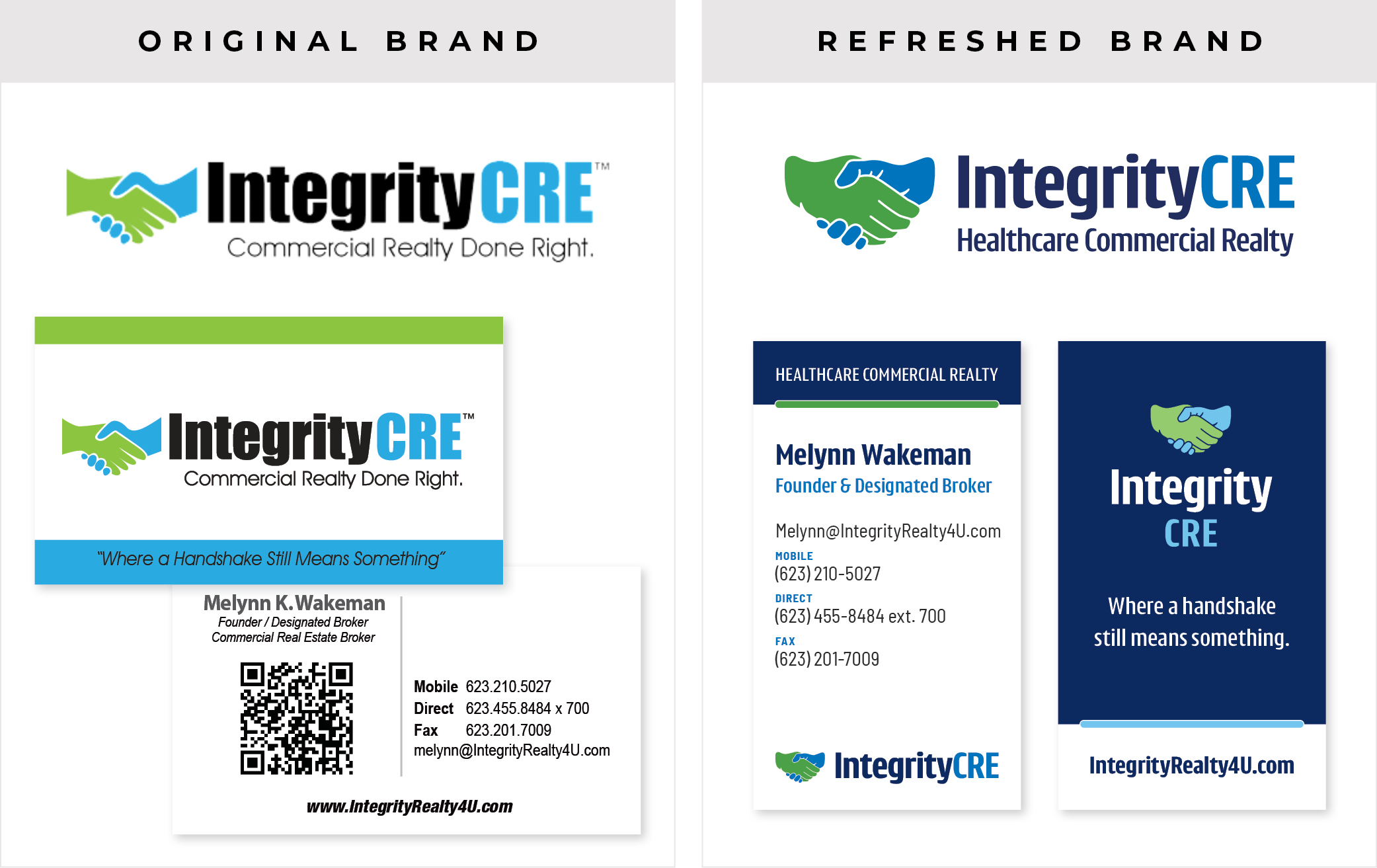
Integrity CRE is a commercial real estate business that exclusively serves the healthcare industry, but that focus wasn’t always front and center. Their original brand didn’t clearly reflect their niche or the level of professionalism they bring to their clients.
Through a brand refresh, Composion helped clarify their positioning, sharpen their messaging, and design a new logo that better represents their expertise. I also created a brand guide to ensure their visuals stay consistent moving forward.
02.
You’re inconsistent across platforms
What to do:
Conduct a quick brand audit. Check all your materials for consistent typefaces, colors, imagery, tone of voice, and messaging. Creating a brand style guide can help you stay consistent moving forward.
Example:
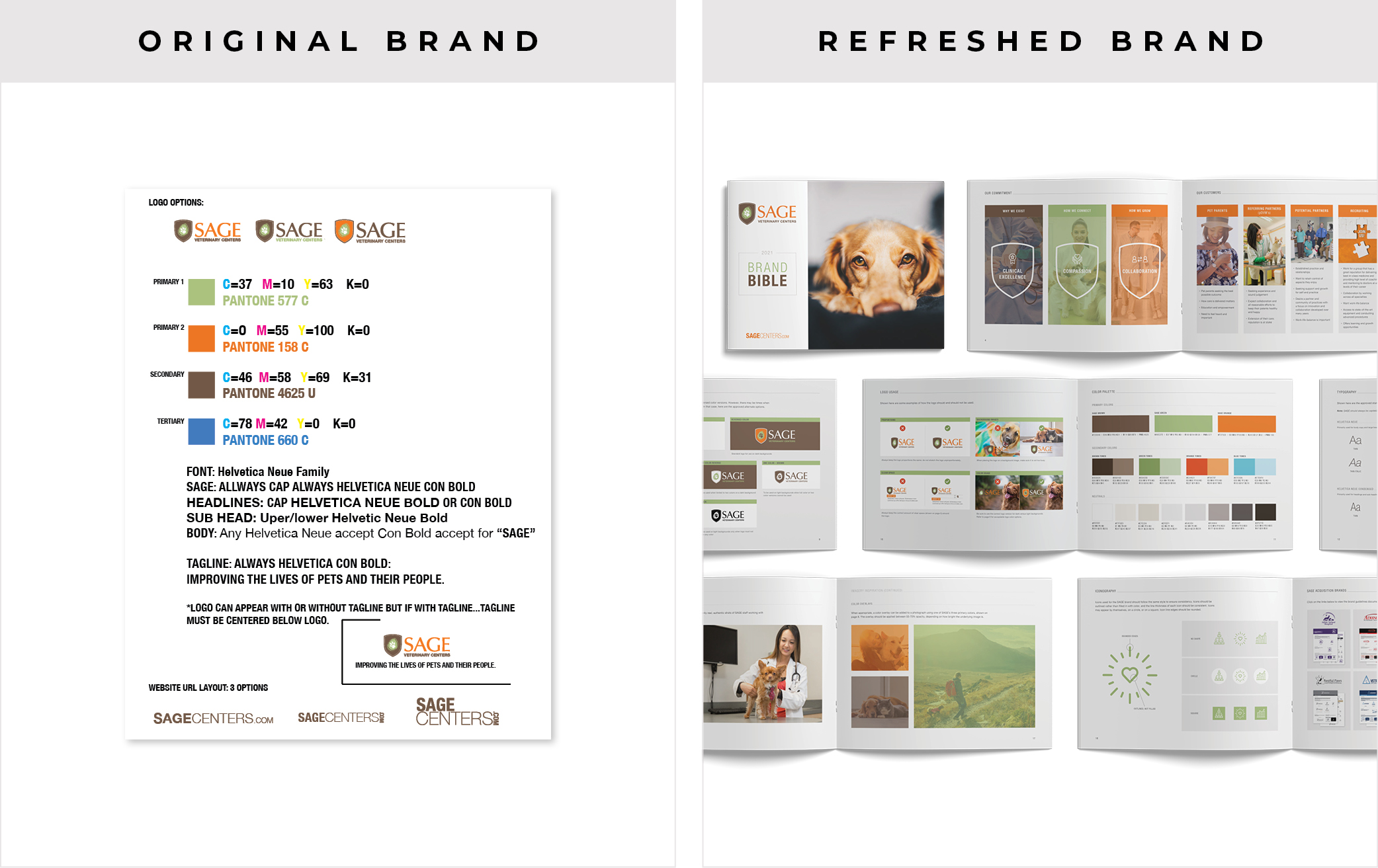
SAGE Veterinary Centers needed a stronger sense of consistency across their visual identity. Composion created a comprehensive Brand Bible that included everything from brand positioning and messaging to logo usage, typography, color, and imagery guidelines. I also developed building signage standards to ensure a cohesive look across all of their hospitals. With the new foundation in place, I was able to bring the brand to life through printed brochures, digital graphics, and more.
03.
You’re not attracting the right people
If you’re getting inquiries from people who aren’t a great fit, or if you’re struggling to stand out in a saturated market, your branding might not be speaking directly to the people you actually want to work with.
What to do:
Take a closer look at your niche and how you’re showing up visually and verbally. Does your brand reflect your ideal client’s values and needs? Are you clearly showcasing how you can solve their problem(s)? A refresh can help you realign and attract more of the right opportunities.
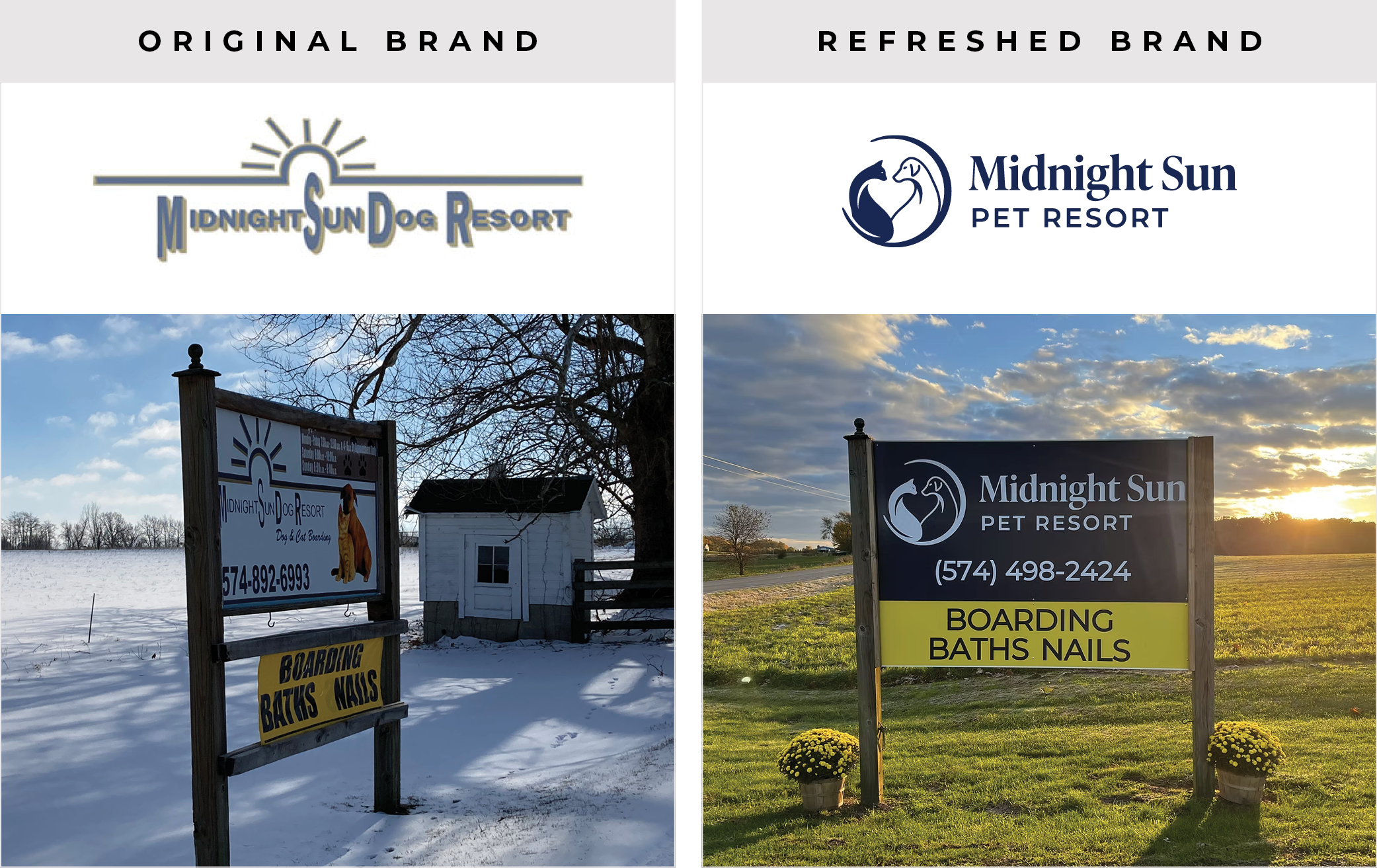
Example: Midnight Sun needed a brand that made it immediately clear what they offer and who they serve. Their original identity was more focused on dogs, but their services also include cat boarding, grooming, and daycare. I refreshed their logo to reflect this full spectrum of care, featuring both a cat and a dog in a harmonious, balanced mark. The negative space between them forms a subtle heart shape, representing the compassion and connection at the core of their work. Now, their brand tells a clearer story at a glance.
04.
You hesitate to send people to your website
What to do:
Don’t chase trends, but do aim for a more modern, polished feel. A designer can help you evolve your look while staying true to your roots.
Example:
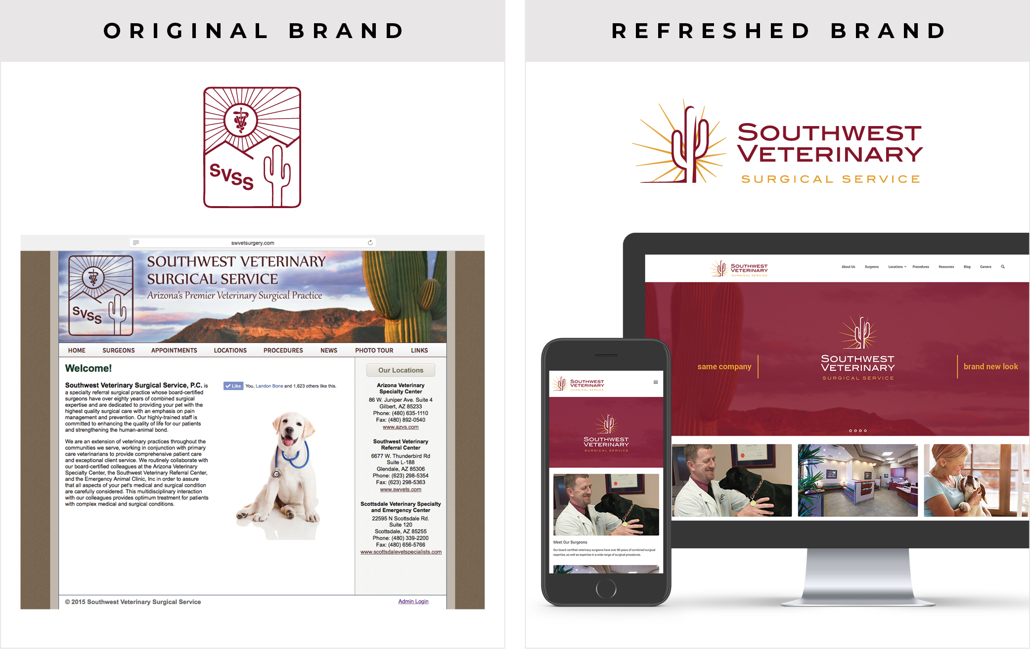
Southwest Veterinary Surgical Service (SVSS) had an outdated website that wasn’t mobile-responsive and didn’t reflect the high level of surgical care they provide. Composion led a full rebrand, including a new logo, website design, and updated print materials. The result is a modern, professional presence that reinforces their reputation as trusted surgical experts. Even over a decade later, the rebrand still holds up—proof that strong, thoughtful design has staying power.
05.
Your visuals feel outdated
Design trends evolve over time, and while timeless branding is always the goal, even well-loved brands need an update to stay current and relevant. If your fonts, colors, or layout feel stuck in another era, a refresh can make a big difference.
What to do:
Don’t chase trends, but do aim for a more modern, polished feel. A designer can help you evolve your look while staying true to your roots.
Example:
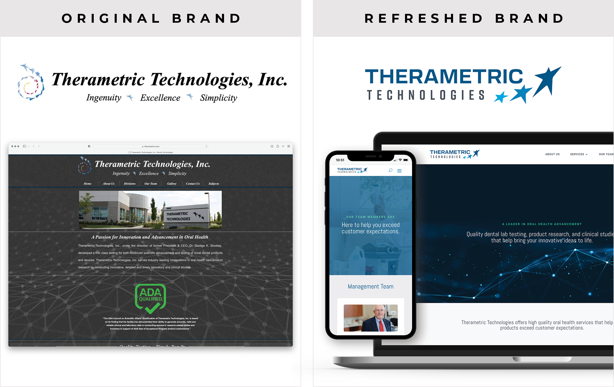
Therametric Technologies, Inc. wanted to modernize their brand while preserving the essence of their original identity. Composion created a refreshed design that honors their legacy, evolving their original three-star concept into a dynamic mark that symbolizes innovation taking shape. The updated logo features a star transforming into a human form, representing the process of discovery, development, and forward motion.
The refreshed brand conveys their core values: innovation, dependability, and experience. I also redesigned their website to align with the updated identity, bringing their digital presence into the modern age with a clean, professional interface that reflects their leadership in the oral health research space.
Ready for a refresh?
Curious what a brand refresh could look like for you?
Book a free Fit Call or learn more about the Brand Action Plan.
Take the First Step
Let’s work together to align your brand with your current vision. Book a call to learn more and see if we’re a good fit.

0 Comments