In the world of graphic design, your logo serves as the visual cornerstone of your brand. It’s a powerful symbol that conveys the essence of your business and leaves a lasting impression. Regardless of whether you have a new business, have recently undergone a logo redesign, or have a well-established brand, these tips will help you maximize the impact of your existing branding. Below are some practical strategies to help you enhance your logo’s visual impact without altering its core design, ensuring your brand identity remains strong and consistent.
01.
Clear Space

02.
Scale Proportionately

03.
Sizing
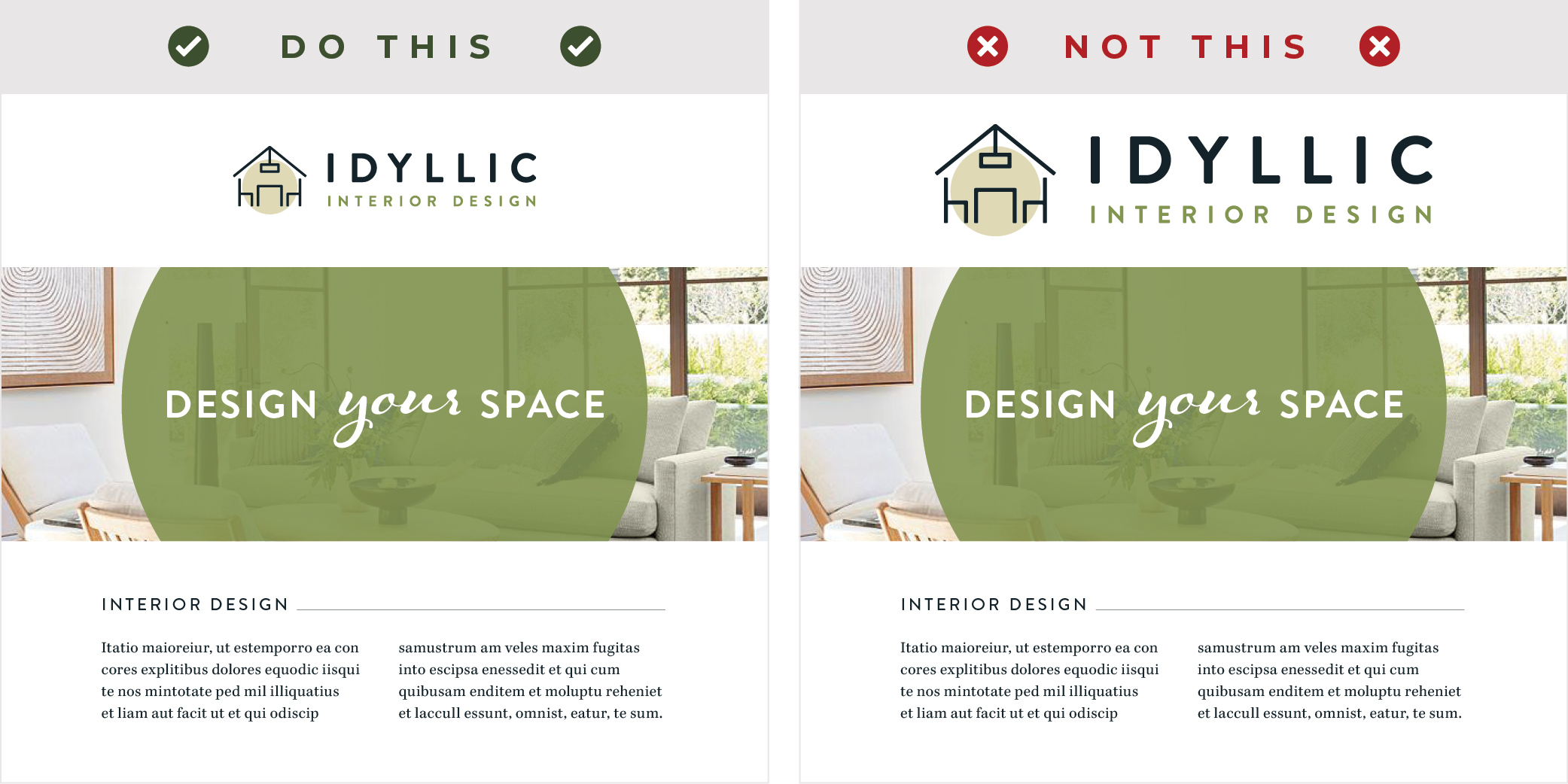
It’s common for people to want their logo to be the largest element on any given design. However, this isn’t always the most effective use of space. The key here is to identify what the primary message is that you want to convey to your target audience and ensure that part of the design stands out prominently. In most cases, your logo serves as a secondary design element, so it can afford to be slightly smaller.
Nevertheless, it’s important to find a balance—a logo that’s too small becomes illegible, losing its effectiveness, while an excessively large logo can overwhelm your materials. The trick is to tailor the logo size to the specific context. Different applications may necessitate different logo sizes. So, always consider the medium and the message to ensure that your logo harmoniously complements the overall design.

04.
Color Variations
Your logo may have been thoughtfully designed with versatility in mind. It’s essential to utilize the right color variations to adapt to different backgrounds and scenarios. For instance, in my logo design process, I always provide clients with multiple color options tailored to diverse backgrounds. Included in these options is a full-color version suitable for white or light backgrounds and a reversed color version for dark backgrounds. Correct usage of these variations is crucial as it directly affects legibility and accessibility.
Furthermore, consistency in color usage is a fundamental aspect of maintaining brand recognition. When your audience consistently sees your logo in the same colors across various applications, it reinforces your brand identity and makes it more memorable.

05.
Images & Contrast
When integrating your logo into a design with an image background, it’s crucial to consider the background’s complexity. A busy image can reduce the legibility of your logo, so select a background that complements, rather than competes with your logo.
Moreover, ensure there is adequate contrast between your logo and the background to maintain legibility. This contrast not only helps your logo stand out but also ensures that it’s readable by people with visual impairments, promoting inclusivity and accessibility.

06.
Consistency is Key
Amplify Your Brand's Impact
Need help with your branding? Get in touch for expert guidance to make your brand leave a lasting impression.

0 Comments