Join me on a journey through creativity as I look back on some of my favorite projects from 2022. Narrowing down the choices is always a tough endeavor, as I genuinely cherish every project that comes my way. Each project I work on holds a special place in my heart!
From collaborating with incredible clients across diverse industries to embracing a multitude of project types, I’ve condensed the selection to six standout projects. Each of these highlighted projects signifies a treasured partnership and a love for the creative process.
Quick Links
Click any of these images to jump straight to that section.
Wildfire Nature
Logo Design & Brand Identity
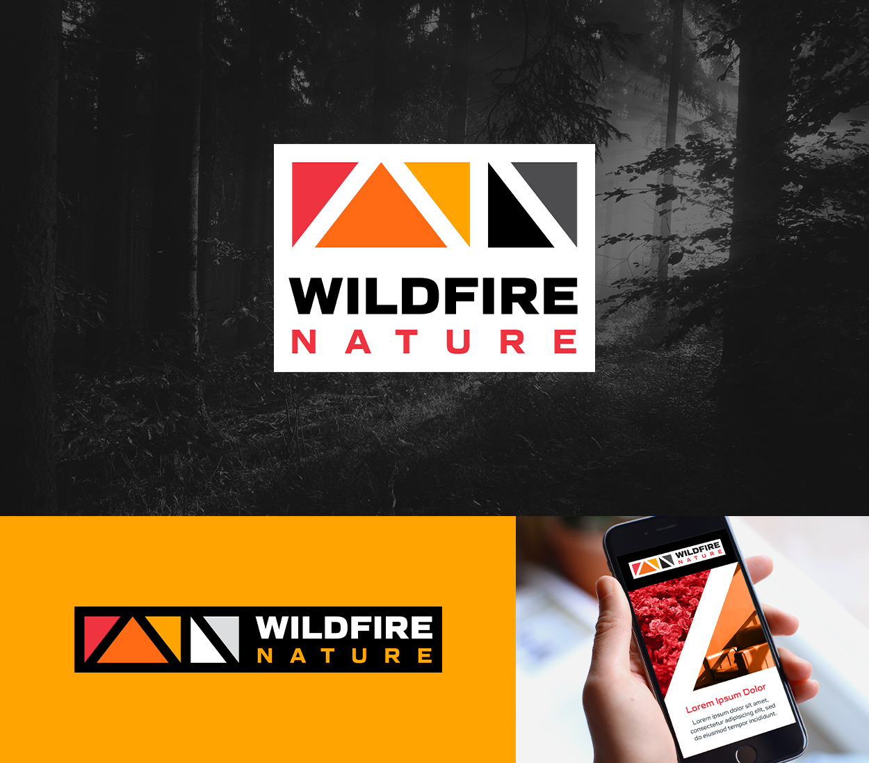
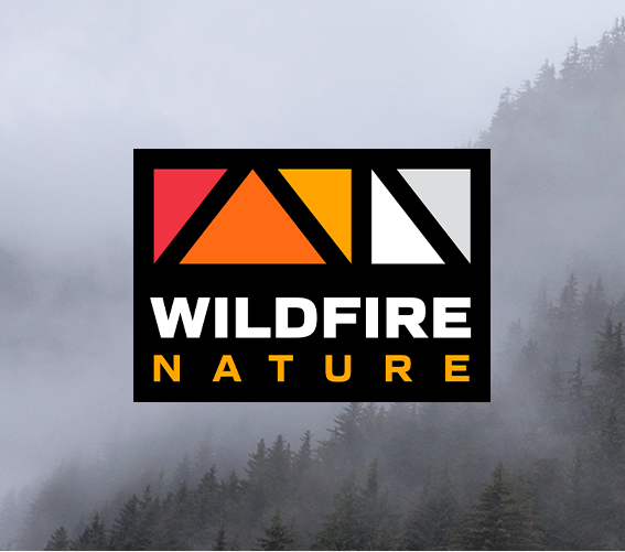
The Wildfire Nature logo design embodies a profound narrative of passion and grit. Rooted in the concept of “wildfire” representing rapid growth and fervor, and “nature” reflecting one’s essence, the brand captures the spirit of those who persevere through challenges with unwavering determination. This dynamic personality is emblematic of a “Wildfire Nature” individual – someone fearless in embracing the unknown because it’s intrinsic to their being.
Wildfire Nature is a full-service creative agency that focuses on video solutions for brand awareness and retention challenges. Their core value revolves around a people-first approach, emphasizing unity amid uniqueness. They aim for positive change by partnering with clients who share a higher purpose, and their strategies blend data-driven insights with storytelling and creative design to craft immersive experiences with targeted messages.
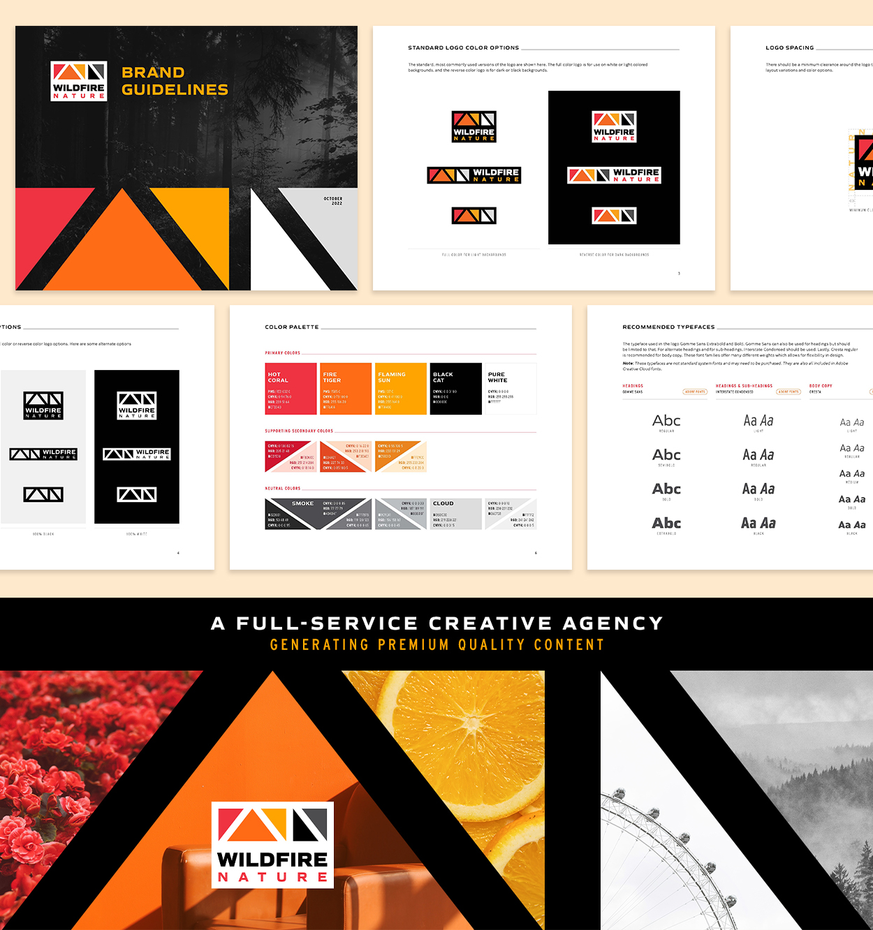
The logo itself encapsulates these ideals. The modern and abstract design employs triangles that subtly form a W and N for “Wildfire Nature,” creating a landscape rectangle reminiscent of ultra-wide video screens.
Each shape is a triangle with three points, which embodies the collaboration between the agency, their clients, and their clients’ audiences. The rectangular enclosure enhances legibility and adaptability across applications. The vibrant color scheme and bold, contemporary typeface underscore the brand’s energetic and professional essence. The resulting logo seamlessly integrates with the brand’s ethos and applications, promising a compelling visual representation of “Wildfire Nature.”
Furthermore, the brand guidelines document serves as a navigational tool, providing valuable guidance on leveraging the Wildfire Nature logo, color scheme, and typefaces. This resource helps to maintain a coherent visual brand across various applications, maintaining a unified identity.
Truckport Express
Promotional Items & Tradeshow Graphics
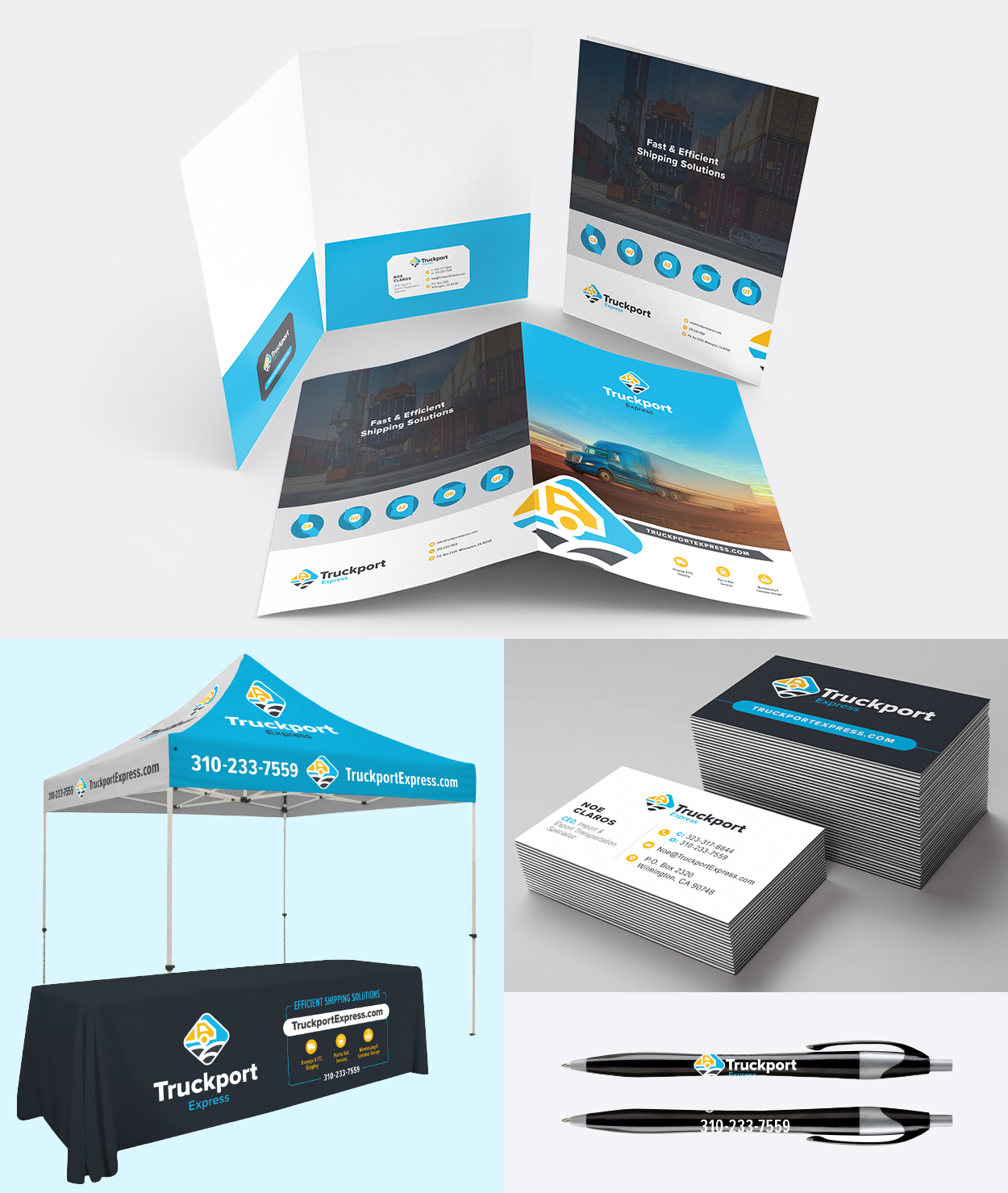
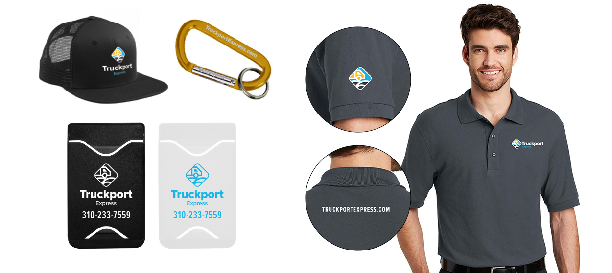
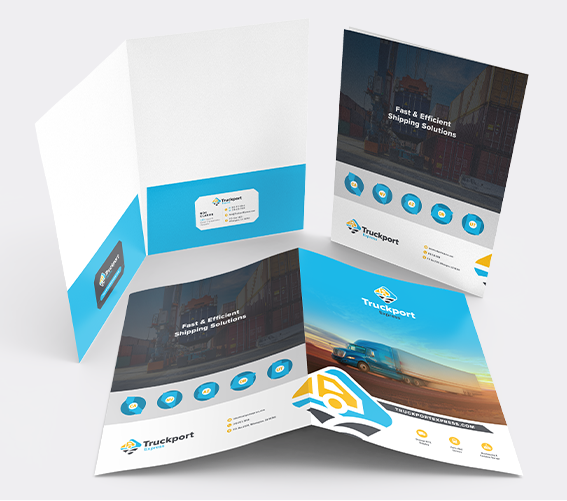
I curated an array of promotional items for Truckport Express, strategically designed to elevate its presence at events and tradeshows. This comprehensive ensemble includes a thoughtfully crafted folder design, branded business cards, an eye-catching canopy design, a tablecloth, and an array of branded merchandise such as pens, carabiners, phone wallets, hats, and polos.
Each element within this collection serves as a testament to Truckport’s commitment to professionalism and cohesive branding. These promotional materials collectively harmonize the visual identity, enabling Truckport to make a memorable and distinct impression in diverse settings, reinforcing its status as a reliable and high-caliber shipping and logistics company. With this tailored suite of items, Truckport stands poised to capture attention and leave a lasting mark on its audience.
Inversiones TP
Logo Design & Brand Identity
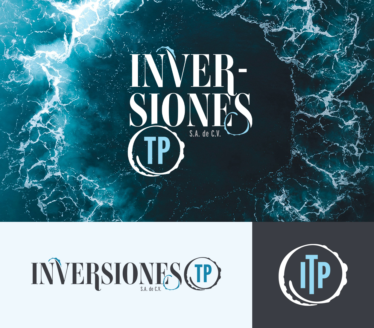
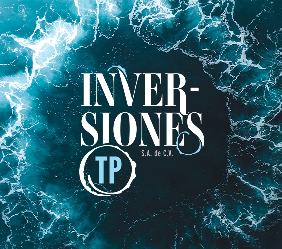
Inversiones TP, an El Salvador-based investment firm, sets the stage for a dynamic branding evolution. “Inversiones,” Spanish for investments, is harmoniously paired with “TP,” derived from Truckport – a sibling company to ITP and a valued client of Composion. Inversiones TP will be an overarching brand that has many other companies under its umbrella.
The logo’s abstract design incorporates tentacles, subtly hinting at an octopus within the typography. Octopi, renowned for their intelligence, adaptability, and tenacity, embodies the ethos of the brand. Having many different tentacles, an octopus also signifies the diversity of brands encapsulated by Inversiones TP.
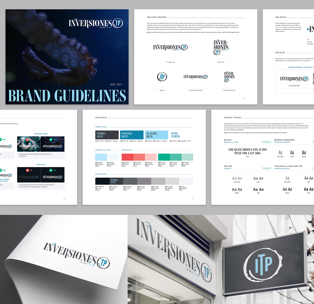
The tentacles’ graceful interplay with typography lends a playful aura without compromising the logo’s professionalism and trustworthiness. Anchored by a deep blue palette that resonates with the hues employed by sub-brands, the design establishes visual harmony between parent and subsidiary entities, fostering unity.
Additionally, the brand guidelines document stands as a roadmap, offering insights into using the ITP logo, color palette, and typography. It’s a comprehensive tool that ensures consistency when using the brand assets.
Paramount Pool & Spa Systems
Ireland Dealer Trip Materials
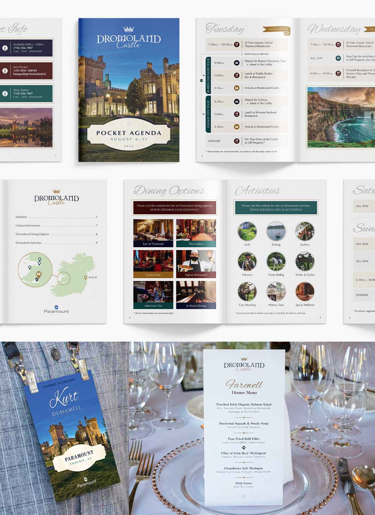
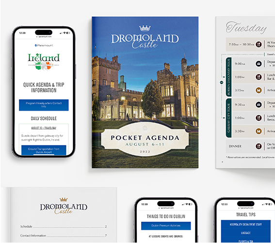
Each year, Paramount Pool and Spa Systems hosts an enticing dealer expedition known as Passport to Paradise. This exclusive program allows dealers to accumulate points towards the cost of attending. In 2022, I played a pivotal role in designing items for the memorable Ireland trip, a venture that unfolded through a Dromoland Castle pre-trip and a main trip with stays in Dublin and Killarney.
My creative involvement took shape in various forms. For the Dromoland Castle pre-trip, I designed a pocket-sized agenda, intended to be a quick and easy on-the-go reference. I also conceptualized elegant name badges and a carefully curated menu for the farewell dinner, adding a touch of personalized sophistication to the trip.
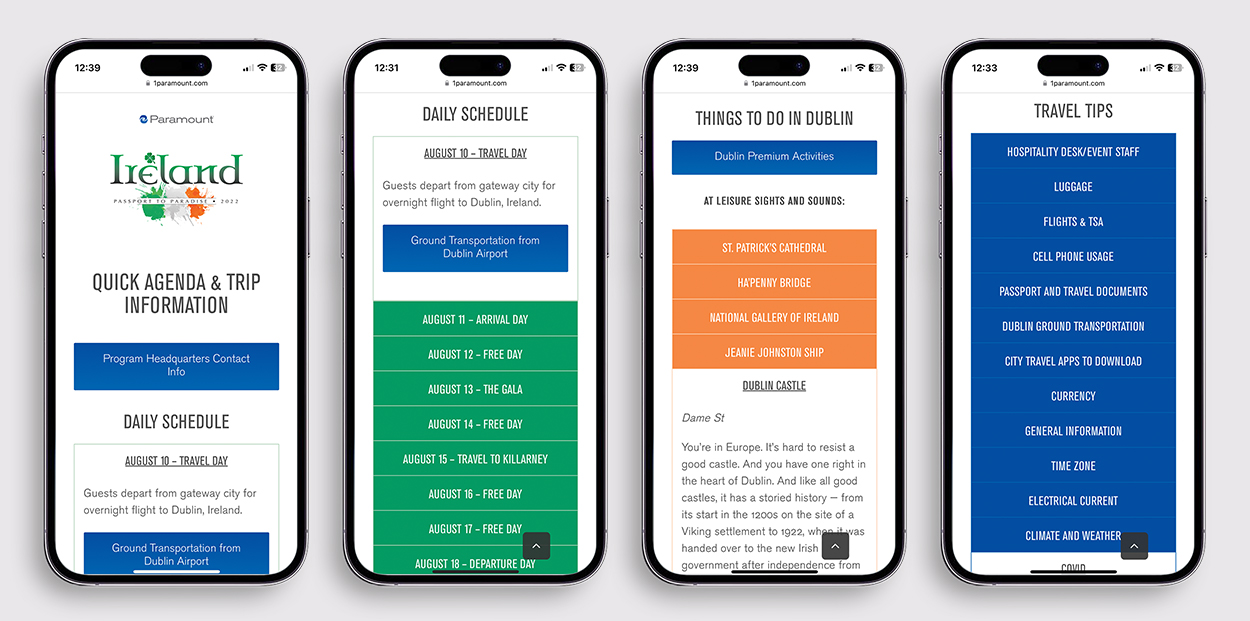
As the journey extended into Dublin and Killarney, I designed and developed a mobile web page that acted as a hub for essential trip information. This digital resource encompassed a streamlined agenda, daily schedules, an array of Dublin and Killarney highlights, as well as invaluable travel tips. This digital companion ensured that participants could easily access and navigate through their Irish escapade.
Therametric Technologies, INC
Logo Design, Branding & Brand Strategy
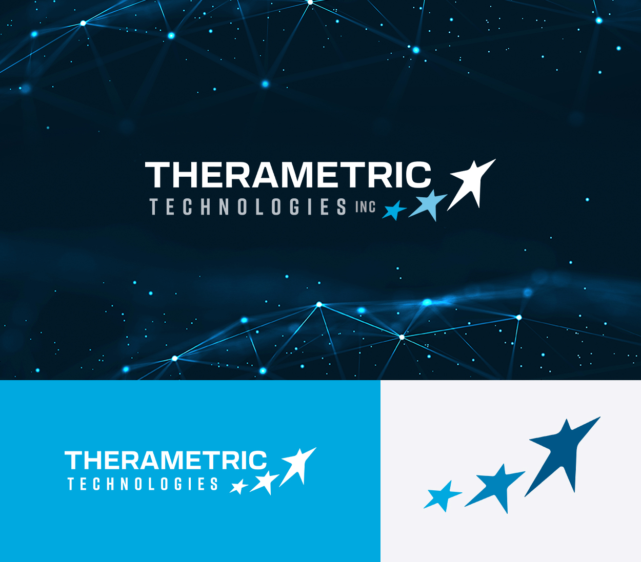
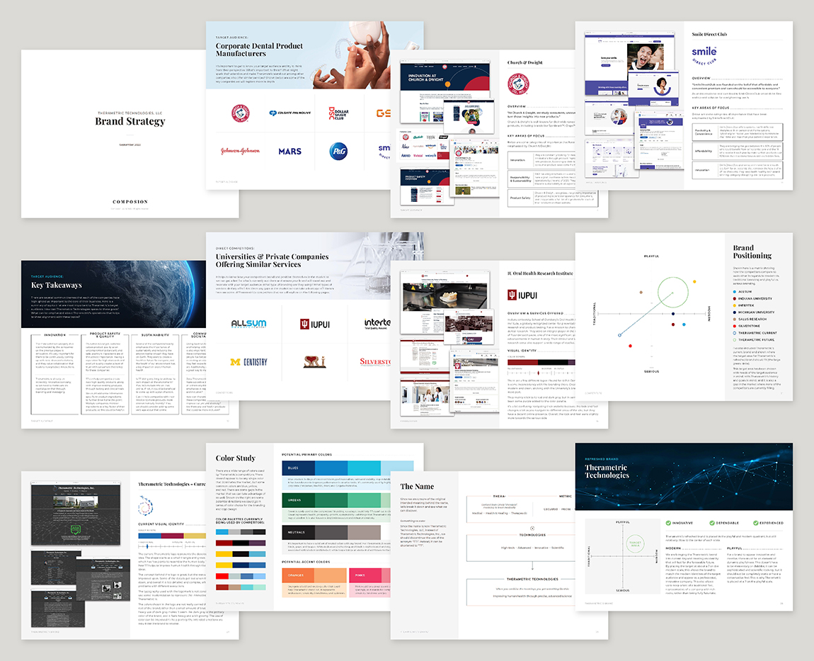
Therametric Technologies, Inc. hired Composion for the Comprehensive Brand package, which provides a strong strategic foundation for the brand identity. I did research into the target audience and direct competitors and put together an in-depth, 27-page brand strategy document, which laid the foundation for the brand’s identity.
Throughout the research phase, I discovered the core values that are most important to the target audience, corporate dental product manufacturers. This helps in determining brand positioning, messaging, and visuals. Innovation, product safety and quality, sustainability, and societal impact are among the most important values the target audience holds.

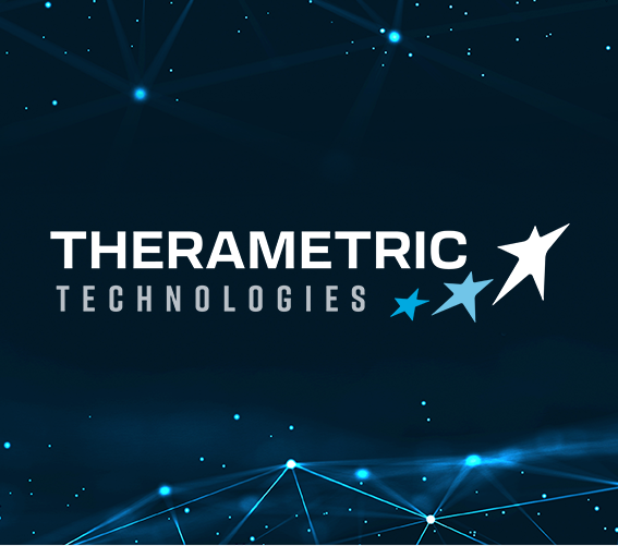
The redesigned logo pays homage to Therametric’s original concept, where an arrow morphs into a star, depicting the process of an innovative idea forming. The five-pointed star symbolizes the human body, while the forward and upward-pointing motion signifies progress and new ideas. This represents how Therametric helps to improve human health through the growth of new ideas.
The color palette, dominated by blues, radiates trustworthiness and dependability, while the geometric typefaces play up the “metric” portion of the name and evoke a modern aesthetic.
Therametric’s refreshed brand was strategically designed to fit within a gap in the current market. By combining playful and modern styling, we achieve a balance of innovation and tradition. The Therametric brand now embodies innovation, dependability, and experience, effectively reaching out to its target audience and setting the stage for growth.
10ZiG Technology
Inspirational Video Editing & Motion Graphics
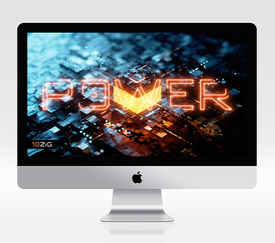
The objective behind this video project was to ignite enthusiasm among IT professionals by showcasing the excellence of 10ZiG’s products.
Strategically managing a modest budget and a tight timeline, we creatively integrated a thoughtfully curated collection of stock video footage.
Leveraging the script and voiceover provided by the 10ZiG marketing team, my role encompassed crafting the visual narrative. I laid out a detailed storyboard, which outlined each script segment’s visuals and illustrated the overall flow of the video. With their seal of approval on the storyboard, I seamlessly transitioned into the editing phase.
Unlock Your Brand's Potential
Striving to help businesses thrive through strategic branding, cohesive printed marketing materials, and intuitive digital experiences. Reach out for a free consultation and custom quote!


0 Comments