Did you know the human brain recognizes color before content? The sequence in which our brains perceive visuals is shape first, followed by color, and content last. This means an audience will form a subconscious feeling or bias toward a brand before even reading any words.
People make up their minds within 90 seconds of their initial interactions with products or brands, and anywhere from 62-90% of that assessment can be based on colors alone. It has been scientifically proven that color can be used “to increase or decrease appetite, enhance mood, calm down customers, and, reduce perception of waiting time, among others.”
Understanding Color Psychology
Color psychology is the study of how colors can impact our emotions, feelings, and even behavior. Different colors can evoke distinct responses, making them powerful tools for branding. For example, orange can create a sense of excitement, while blue tends to convey feelings of trustworthiness. However, cultural and personal experiences can also affect the way color is perceived by a specific audience.
Know Your Audience
When selecting brand colors, it is crucial to consider your target audience. People from diverse cultural backgrounds, various age groups, and different gender identities may not all have the same reactions to specific colors. Cultural associations, personal experiences, and societal norms can heavily influence how individuals perceive and respond to different hues. By using known predictions and expectations about your target audience while being mindful of their diverse perspectives, you can create a more inclusive and appealing brand identity that fosters a stronger connection with your customers.
It is also important to consider accessibility. Color blindness affects an estimated 300 million people worldwide, so it’s necessary to make sure your chosen color palette offers enough contrast for design elements and type to remain legible. By making these deliberate choices, you can create an inclusive experience for everyone, regardless of their visual abilities.
Context is Key
While the choice of color matters, how they are applied is just as important. Some argue that context holds more significance than the color itself, but I believe it’s a healthy mix of both. An excellent example of this is yellow, which is often associated with happiness and joy (think smiley faces and sunflowers), yet it is also used in traffic warning signs.

When selecting brand colors, there is no rigid rulebook to follow. Color is just one piece of the brand puzzle, and it must align with the brand’s context and the broader industry landscape. Striking the right balance between standing out from competitors and resonating with customers is key—avoiding being too jarringly different to alienate the audience. Ultimately, the goal is to find harmony between the expected and the unexpected, creating a lasting impression that embodies the brand’s identity and values.
Owning a Specific Color
Owning a specific color in branding involves establishing a strong association between a brand and a particular color, to the extent that the two become inseparable in the minds of consumers. When a brand successfully owns a color, it gains a unique and distinct visual identity, making it instantly recognizable and memorable.

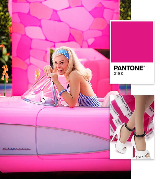
Think pink, and one brand that immediately comes to mind is Barbie. Believe it or not, pink was not always known as a feminine color in the United States. In the early 20th century, pink was considered a masculine color because of its close proximity to red, and it wasn’t until the 1980s that pink became strongly linked with femininity. Mattel, the creators of Barbie, adopted pink to represent the brand in the 1970s, and that contributed to the associations we have with pink today. Now, the doll is synonymous with the color and Mattel even has a copyrighted Pantone shade called Barbie Pink (219 C). This example serves as a compelling illustration of how branding wields significant influence in shaping people’s perceptions and emotional connections with colors.
Fun fact: The new Barbie Movie (highly recommend, by the way) used so much pink paint that it caused a global paint shortage.
Getting Creative with Color Combinations
While owning a specific color can be powerful, it’s not the only way to stand out and create a distinct brand identity. Brands can differentiate themselves and leave a lasting impression through the use of unique color combinations or by applying their brand colors in a creative and distinctive manner.

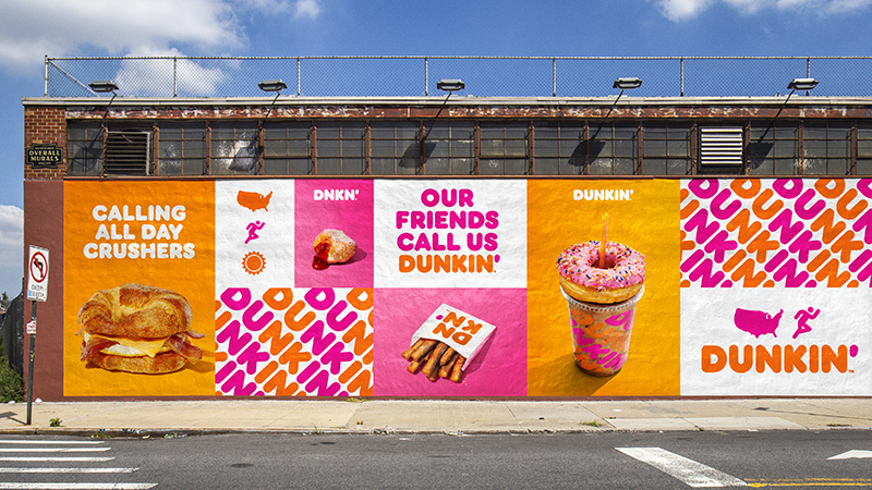
For instance, Dunkin’ has a unique candy-like color combination of orange and pink in its branding. These two particular colors are not typically associated with coffee or donuts individually, but when used together, they form a strong and memorable brand identity. The unique pairing sets Dunkin’ apart from other brands in the industry, making it instantly recognizable.
In the world of music, Taylor Swift stands out not just for her exceptional talent but also for her distinctive use of colors to define each era of her music. Taylor masterfully employs a unique palette to differentiate each of her eras and give them a specific vibe. Each hue acts as a visual thread (er.. invisible string?), weaving together a captivating narrative that resonates deeply with her devoted fans.
The mere sight of light blue transports fans to the iconic “1989” era, while purple evokes memories of “Speak Now,” and pink unmistakably symbolizes “Lover.” Taylor’s skillful use of color goes beyond aesthetics to a treasure trove of hidden “easter eggs” and cryptic clues for fans to decode. Being a swiftie is like being in a secret club where colors take on a whole new meaning.

Conclusion
In conclusion, color plays a pivotal role in branding and has the power to evoke emotions, influence perceptions, and create memorable associations with your brand. By understanding color psychology, choosing the right colors, and maintaining consistency, you can craft a powerful brand identity that resonates with your audience. Embrace the power of color and watch your brand flourish in the competitive market!
Transform Your Brand with Color
Ready to transform your brand with the power of color? Reach out through the contact form and let’s work together to create a memorable and impactful brand identity!

0 Comments