After much deliberation, I ended up choosing two projects from each of my three main categories (brand identity, print design, and digital experience) to highlight here. Feel free to scroll through the list to learn more about each project!

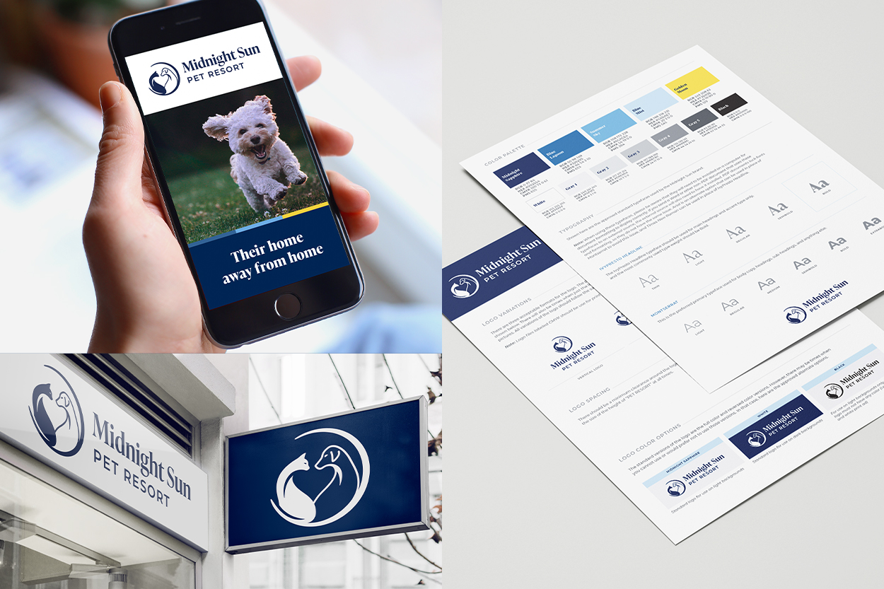
I designed a logo that peacefully brings together the unexpected duo of a cat and dog, with the negative space between them forming a heart shape. The animals are encapsulated within a crescent moon, which plays on the name “Midnight Sun” since the equivalent of a sun at midnight is the moon.
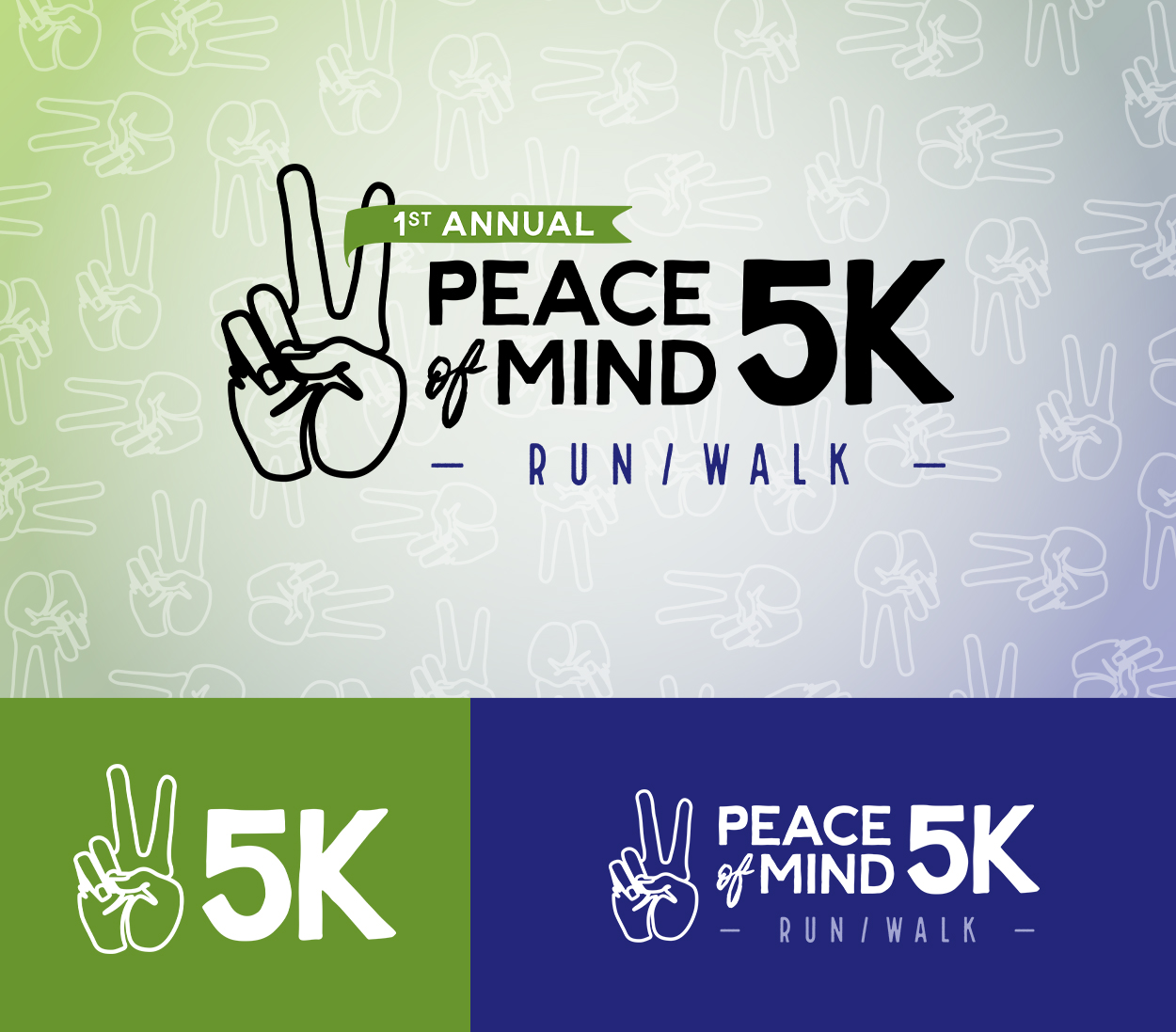
I enjoyed working with them on the logo and branding for the 5K, which features a hand making a peace sign and has an overall inviting and approachable look and feel. With green being the color representative of mental health and purple representing intuition, the overall brand identity encompasses the soul of the brand.
Interested in participating in the run on May 7th? Join my team here!

To create a cohesive brand identity, I also designed some custom patterns, shown above, along with a brand guidelines document outling how to use the logo and other brand elements.
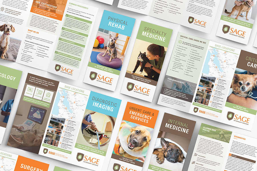
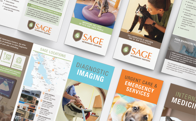
We were able to build upon the brand standards that were defined in Sage’s Brand Bible, which Composion designed in 2020. I loved seeing all of the branding elements harmoniously come to life in this brochure series!
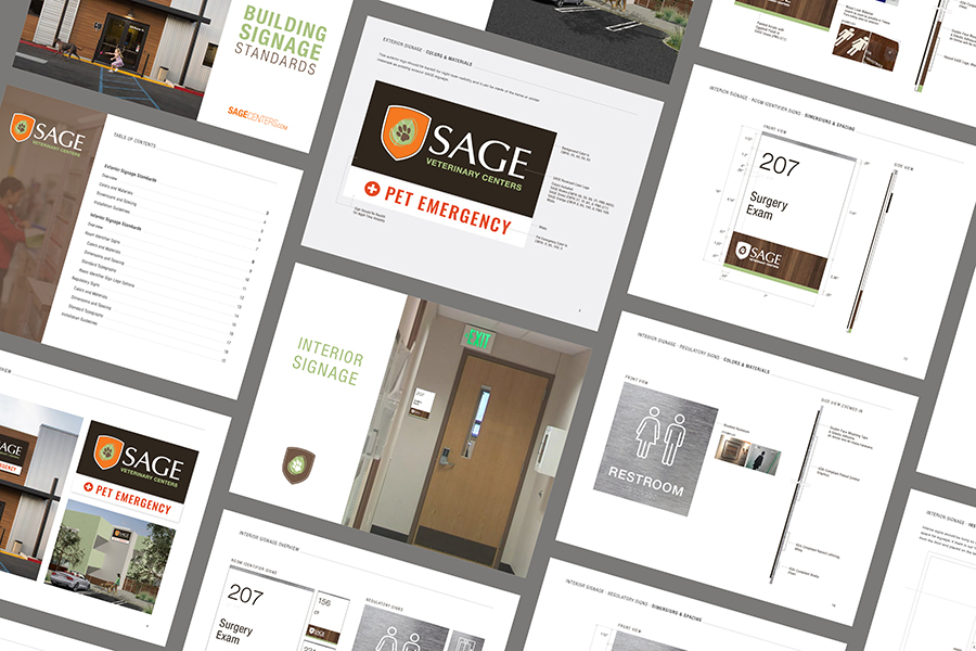
Bringing your pet to the vet can be a stressful experience, and anything that can be done to create a feeling of comfort and stability is helpful. Now, going forward, both customers and Sage staff will know what to expect and will have a feeling of comfort and familiarity, no matter which hospital they visit.
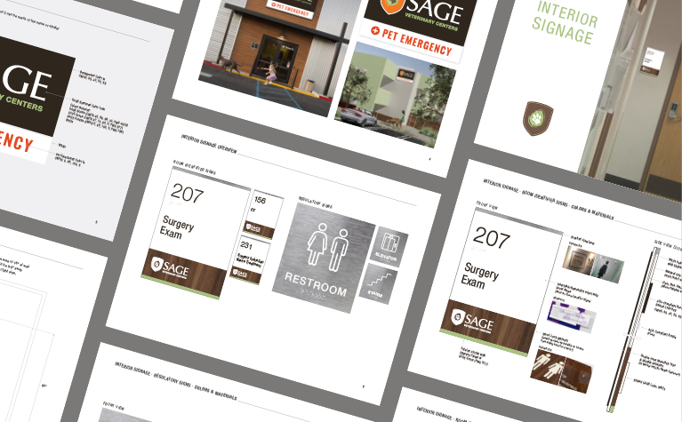
The signage standards includes guidelines for both interior and exterior building signage, along with dimensions, spacing, colors, materials, and typography.
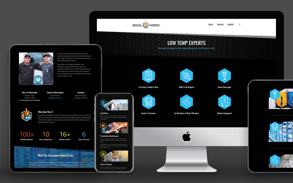
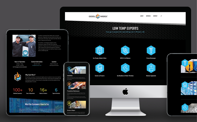
One of the requirements was to have an easily editable website so he can go in and make updates at any time. I built a fully responsive user experience using WordPress, along with an instructional guideline document on how to use the website.
The website clearly explains Cool Werx’s offerings, and the unique design is attractive while remaining uncomplicated.
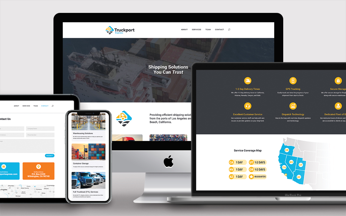
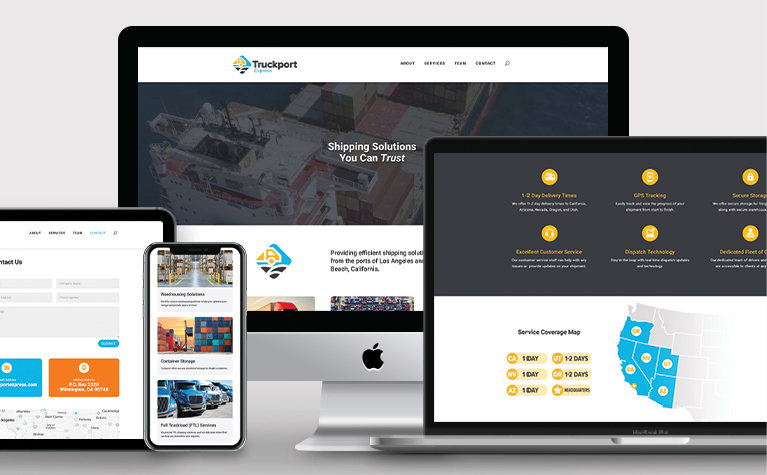
Building upon their existing brand, I used WordPress to design and develop their new website that clearly explains their services along with key offerings that their customers value.
Now, they have a professional online presence that is on par with their competition and allows them to attract new clientele.
Curious What We Can Do for You?
We strive to help businesses thrive through strategic branding, cohesive printed marketing materials, and intuitive digital experiences. Contact us to get a free consultation and custom quote!



0 Comments